Do not use average latency
It might sound tempting to use average latency as the sole indicator of performance, but in reality, this might not be the best idea.
In theory, visualising it will catch most of the changes in traffic, so many people think it’s enough to put this on your Grafana dashboards to see how your frontends are behaving.
But in reality, this is not the best way to monitor latency, if it doesn’t has symmetric distribution.
Let’s take a look at this example:
Joe is using a formula to get the average response times, and their SRE/DevOps team is using a graph based on this as the only indicator of trouble.
sum(rate(nginx_http_request_duration_seconds_sum[5m])) by (instance)
 /
sum(rate(nginx_http_request_duration_seconds_count[5m])) by (instance)
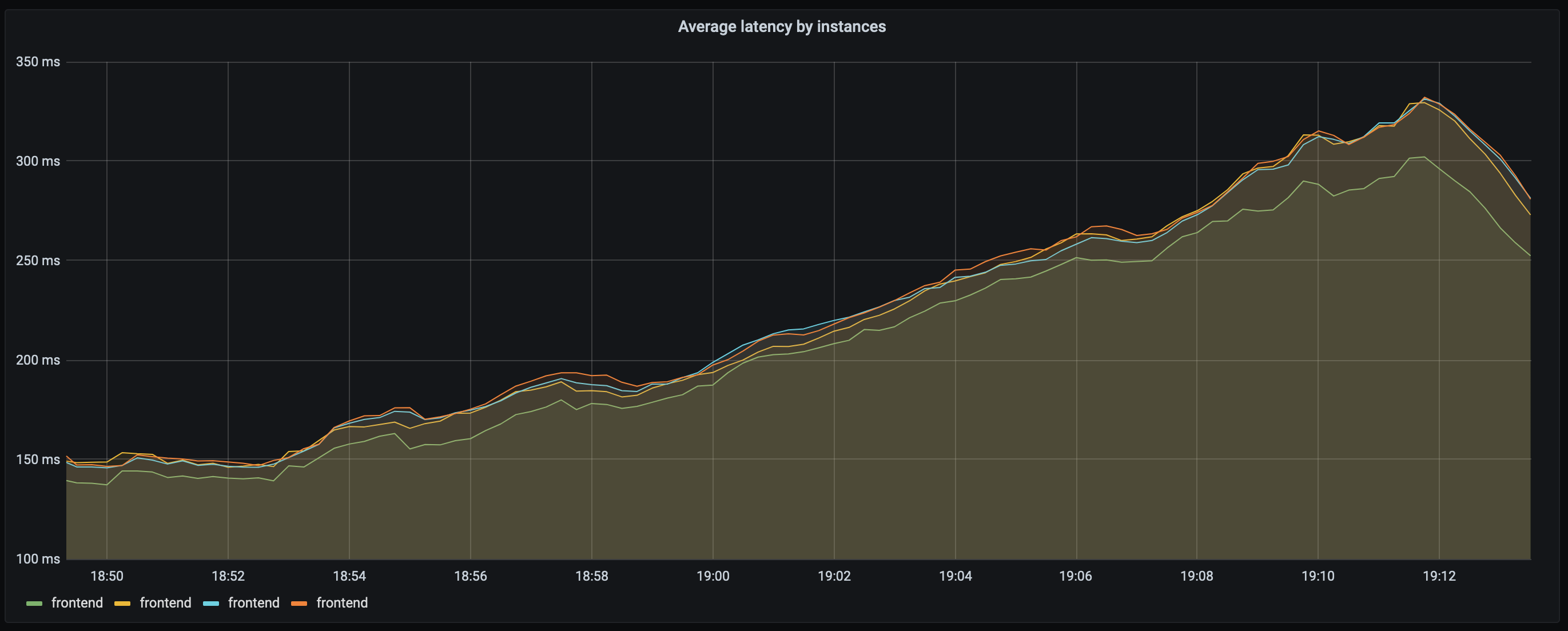
The graph looks like this:

Your application can be considered “working as intended”, the latency is OK.
There’s that bump on the right, but it’s just a bit over 300ms, so you think it’s not a big deal.
Now, let’s take some percentiles, and compare them to the average.
P50
The 50th percentile is the median.
The basic feature of the median in describing data compared to the mean (often simply described as the “average”) is that it is not skewed by a small proportion of extremely large or small values, and therefore provides a better representation of a “typical” value.
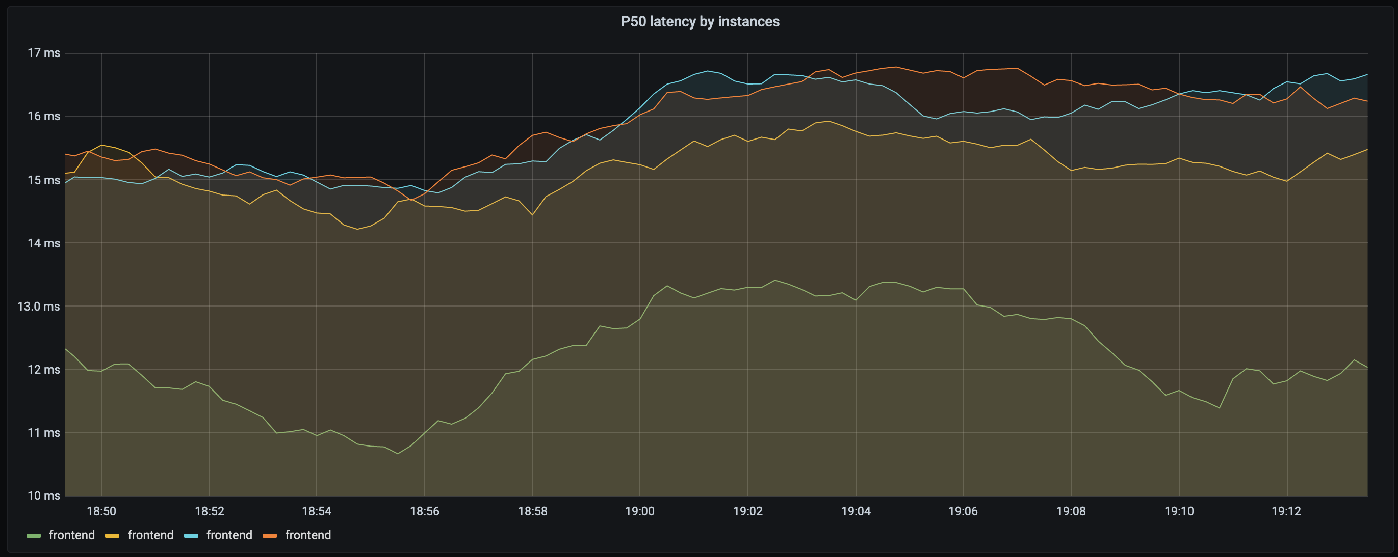
This is the P50 graph for the same timeframe:

Oh, hey, everything is fine, since we are serving at around 16ms, even during the spike for half of our customers (more like half of the requests).
But it’s not fine, even based on the average it’s clear that something is off, and you cannot switch to a single panel graphing only the 50th percentile, because you will miss these spikes.
P90
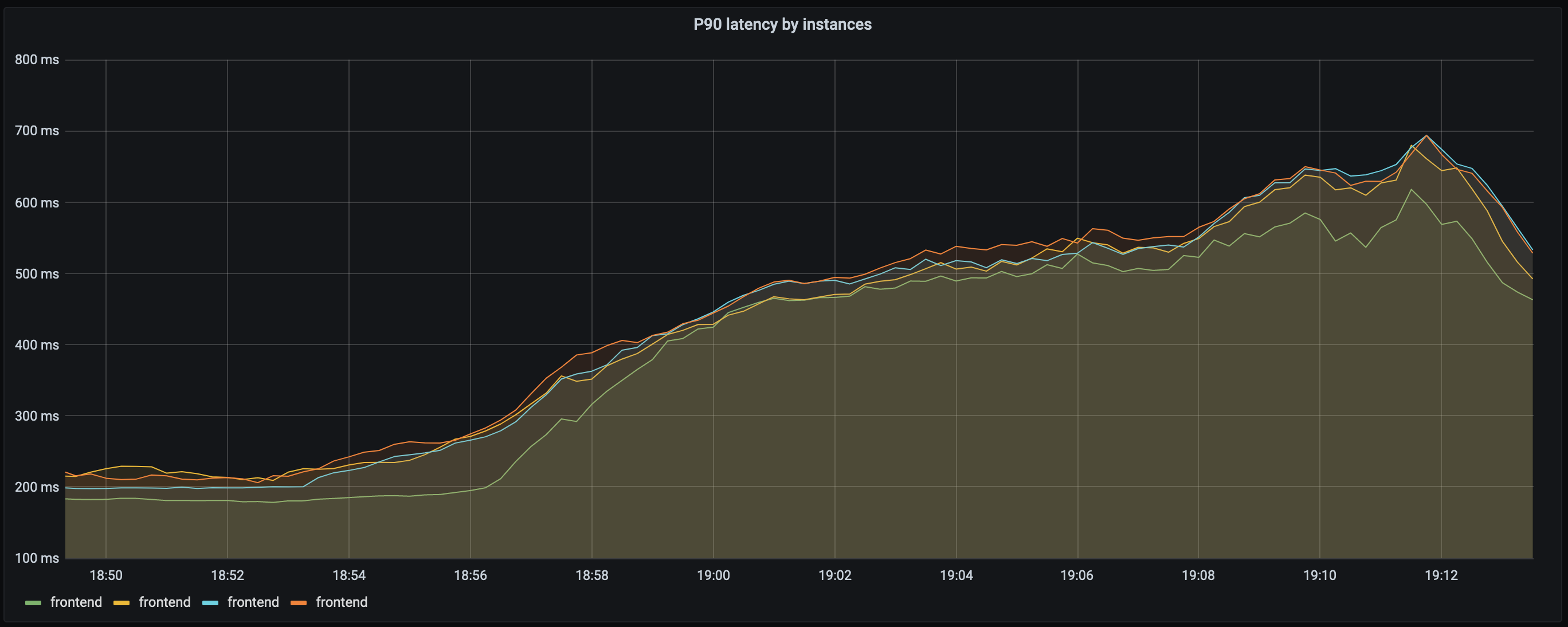
Alright, let’s take a look at the 90th percentile, that’s almost all of our requests.

We can see response times reaching almost 700ms, 680ms to be precise, which is more than double the average that Joe and his team were using initially.
But we cannot use only the 90th percentile either as these will mask many details, e.g. the load balancing issue of our “green” frontend on the screenshot of P50.
Summary and a few tips
Latency can appear as one of the easiest things to monitor, but as it turns out it can be misunderstood/misused easily.
If you only examine average latency, you will inevitably think that all request run at equal speed, but that’s not true, and it will hide outliers.
As this example illustrates, simply paying attention to certain percentiles or the average is not sufficient. The head and tail of the distribution matter and the average is far not enough.
To truly understand latency you have to examine various percentiles, compare these to each other and pay attention to the context of the requests.
What calculations/percentiles should be used then?
I’d start with having panels for P70 and P90/P95, as these will cover a wider part of the distribution. This way you will have outliers with the higher percentiles, and you will also see the effects of performance improvements (and degradation) with the median.

Having P70s visualised per instance (be it servers or pods) AND adding (a summed) P90 to the same panel can help to identify the sources of certain behaviours while keeping the panel readable.
On the image above, you can see that around 17:23, we had a smaller spike of 1s latency in P90, and the P70 graph is showing us an instance with longer P70 values. This won’t necessarily highlight the actual instance of course, but it can make finding logs for certain issues much easier.
Another tip would be to to set the Y axis’ scale to logarithmic (base 10 might work better on smaller panels, base 2 is good for large ones), to make P90 pop out more.
Additionally, it might make sense to look into Apdex score as well. Apdex should give you insights about user satisfaction, if you define maximum satisfactory latency and maximum tolerable latency.